When branding, consider the boldness of the logo or the classic style of the black headline of The New York Times. When editing and calling, please keep your favorite magazine layout in mind, and consider how different fonts are used in various applications on the phone. However, when the typography is not good, it can be annoying, distracting, or illegible.
In the app, you may be confused by obscure text, obfuscated markings, or challenging to understand incomprehensible brochures or product packaging. However, in this article, we will discuss what typography is, its importance, and the basic principles of typography.
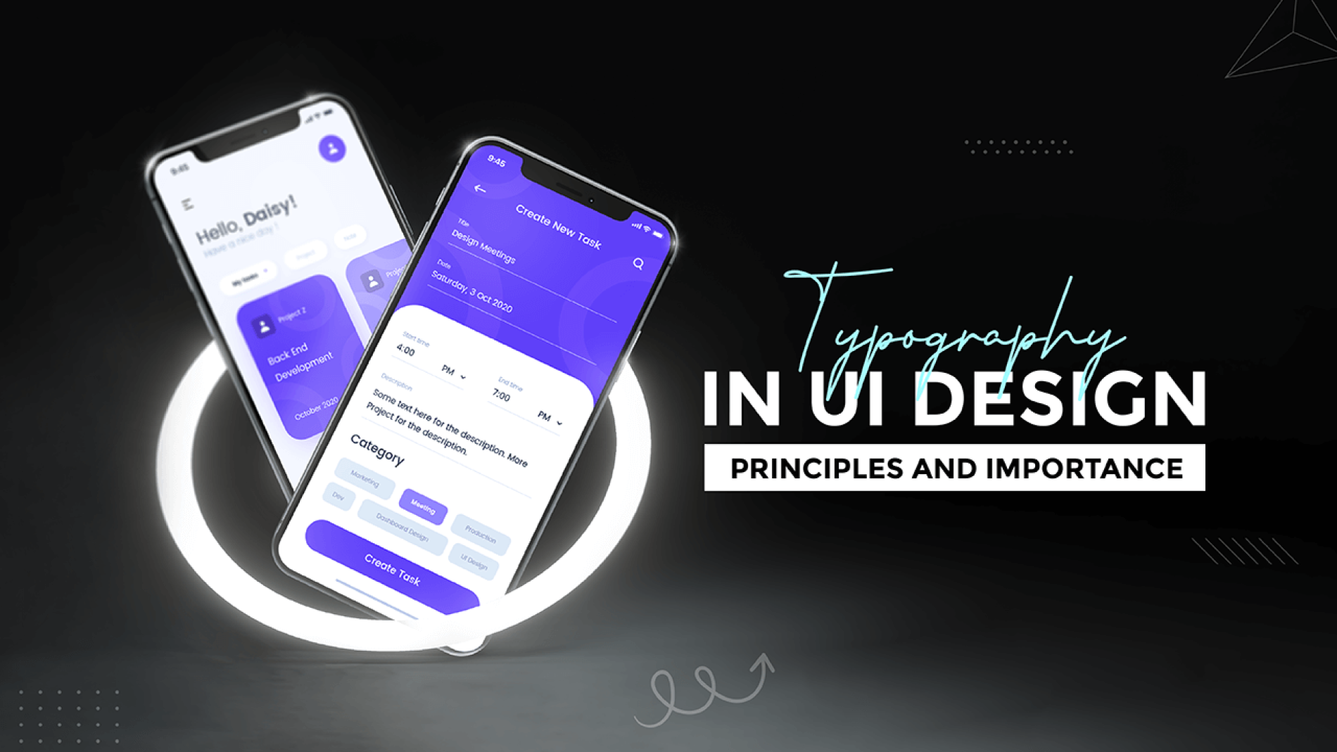
What Is Typography?
Typography is one type of art that involves setting fonts in different combinations of font, size, and spacing to impress people. Designers use typography to incorporate text into the design. They strategically use fonts to make the text legible and impress the audience. For brand graphic designers, many important considerations are considered when using typography. You need to make an informed decision about font, size, text, spacing, position, and many other aspects of using the font.
Why Is Typography Important?
Typography is more than just choosing beautiful fonts. It is an integral part of user interface design. Good typography enhances clarity and engagement, guiding the reader’s attention and making the content more accessible. In design, it’s not just about aesthetics; it’s about creating a visual hierarchy that communicates the importance and relationships of the content effectively.
Typography Can Increase Brand Awareness
Own your brand on your website. Unique and consistent fonts will help you build a strong following, build user trust, and drive the brand forward. If your typography is good, it will help to grab the attention of your customers. Indeed, it will increase the brand value of your company and make your company more trustworthy.
Typography Influences Decision Making
Typography profoundly impacts how users process and perceive the information conveyed in the text. The style, size, and arrangement of text can evoke specific feelings, create trust, or even prompt action. For example, bold, clear fonts might instill confidence and urgency, leading to quicker decisions, while elegant, serif fonts can convey sophistication, encouraging thoughtful consideration.
By shaping the visual experience, typography subtly guides our perceptions and choices, making it a powerful tool in communication and design. So, you need to keep in mind that your first impression should be impressive. If it’s positive, then it will influence a lot for the decision-making of your customers.
Typography Attracts The Attention Of Readers
Good typography can make a difference if you stay on the site for a minute or half an hour. The important thing is that your website must be visually stimulating and memorable, and typography plays a vital role in this process.
High Impact
Typography can be seen on the interface of almost every product or digital device. For example, typography appears in the content of billboards, coffee cups, online or printed articles, etc.
This information is targeted at the audience and may have subliminal details, depending on the design intent. Creators deliberately use typography to evoke the audience’s reaction, to see how they interact with the brand and what adjustments need to be made.
The Value Of The Increased Sales
The value of increased sales is not only measured in revenue but also in how effectively a brand communicates with its audience, and typography plays a key role in this. Well-chosen typography enhances the readability and appeal of marketing materials, making them more persuasive and memorable. This can lead to higher engagement, stronger brand recall, and ultimately, increased sales.
Basic Principles Of Typography
Consistency in typography maintains a cohesive look across all materials, reinforcing the brand’s identity and improving the overall reading experience. Here you will get an idea about some basic principles of typography:
Hierarchy
One of the most important ways to effectively convey content is to use a printed hierarchy. There are not many interfaces without text on the page. Most user interface layouts consist of several standard elements: text, rectangles/boxes, buttons, and icons. Use these elements that can create or destroy the interface.
The hierarchical structure helps us improve the scanning and readability of the user interface so that users can find important information faster. You should use bigger and bolder text for our text, which is more important because it attracts people’s attention. Smaller, lighter text is ideal for the least important information.
Font Choice
Serif or sans-serif is a safe choice. Choose a font that fits different sizes. Typography can be tricky, and sometimes it’s not worth it. The good news is that IOS and Android have their system fonts that support different thicknesses, sizes, styles, and languages so that we can create an easy-to-read and exciting experience in any application. On Android, the primary font is Roboto, and Noto is the default font for any language. When we use text styles in our writing system, we also support dynamic fonts and larger font sizes for accessibility, which provides greater flexibility by allowing readers to choose their preferred text size.
Text Size, Color, Font And Readability
To make fonts easily read and provide assistance to people with disabilities, such as color blindness, low vision, hearing impairment, etc. we must follow the “Web Content Accessibility Guidelines” (WCAG). Here are some standards for adjusting our user interface to improve readability. Rule of thumb: text size must be at least 16. However, for example, if it is a TV interface, the text should be more significant.
Download the Stark plugin to ensure it meets this standard in XD, Sketch, and Figma. For example, the error status should be displayed with multiple red outlines. Use warning symbols and descriptive text to draw your attention to the problem. The text size should be at most 200% without affecting the readability of the content or the use of functions. Do not use unnecessary text images like logos.
Line Height
Line height is the vertical space between lines of text. It plays a crucial role in readability and the overall visual appeal of a design. Proper line height ensures that text is comfortable to read, preventing lines from appearing too cramped or too spaced out. The right balance improves legibility, making it easier for the reader to follow the text without straining. Adjusting line height appropriately can enhance the clarity and aesthetic of the content, contributing to a more pleasant and effective reading experience.
Letter Spacing
Use a larger font and reduce letter spacing to improve readability. Use a smaller font size and increase letter spacing to enhance readability. The monitor’s contrast is more vital than the paper’s, so it is more difficult to read in complete contrast. If the blank is not balanced, please copy it. It will be difficult to read.
Measurement
The measurement indicates the line width in a paragraph. It can be in a column too. Text blocks that are too wide can make reading difficult. When forced to move along the horizontal line continuously, eye movements can quickly cause nervousness. On the other hand, very narrow lines of text can cause more pauses in thinking, making it easier to lose context and meaning.
Size Is Important
Text size is important because it directly impacts readability and accessibility. The right text size ensures that content is easy to read for a broad audience, reducing eye strain and making the information more approachable.
Larger text sizes can emphasize key messages, drawing attention to important points, while smaller sizes are useful for less critical details. Properly scaling text size across different devices and formats also enhances the user experience, ensuring that content remains clear and legible in any context.
Leading
The leading is also called line height. It mainly describes the space between lines in a text block. If the white space is appropriately set, it should guide the reader’s eyes through the flow of content, not distract attention. If you don’t become careful about the line height, it may make your text cluttered. High altitude indicates that it is hard to distinguish every paragraph.
Weight
Text weight refers to the thickness or boldness of a font and plays a crucial role in creating visual hierarchy and emphasis within a design. Heavier text weights, such as bold or semibold, draw attention to key elements like headings, important points, or calls to action, making them stand out to the reader.
Lighter weights, like regular or thin, are typically used for body text, maintaining readability without overwhelming the eye. By varying text weight, designers can guide the reader’s focus and convey the relative importance of different pieces of information.
Alignment Is Critical In Typesetting
Non-designers tend to center the alignment of everything. However, center alignment is difficult for the eyes, and the reader cannot tell when the sentence begins or where it ends. This will make people ignore your content thoroughly. Left alignment can do wonders for typography. When we read, we usually focus on the left side, hoping that the content will start here. Be careful when mixing—the alignment in the design. Alignment consistency is the best choice.
Conclusion
Typography is more than just choosing a good font. When used effectively, it can improve the ease of use, readability, accessibility, and hierarchical structure of the interface. In this article, we discussed some general tips and principles of professional typography in user interfaces. Printing terminology constitutes the basis of our knowledge of printing. Typography like kerning, line spacing, and weighting are levers that we can use to create more readable and aesthetic designs.


Add a Comment